Examples
Quickly get a project started with any of our examples ranging from using parts of the framework to custom components and layouts.
Download the InPage source code to snag these examples.
Editing tips
- Enter your text or leave a text box empty.
- Align text vertically and change text size in toolbar.
- Use Google Fonts to make sure that your text is readable, and aesthetically pleasing when displayed.
- Hide text areas and images, simply by clicking hide element button placed in toolbar (to see the button, double click an element of your choice).
Standard components
Standard components to demonstrate best practices for building product cards.
Columns Two
Simple one-page template for photo galleries, portfolios, and more.
Columns Three
A one-page template for building simple and beautiful home pages.

Columns Four
A one-page template for building simple and beautiful home pages.

Columns Five
Simple one-page template for photo galleries, portfolios, and more.

Columns Six
Simple one-page template for photo galleries, portfolios, and more.

Columns Seven
Simple one-page template for photo galleries, portfolios, and more.

Columns Eight
Simple one-page template for photo galleries, portfolios, and more.
Columns With Buttons
Simple table component with three columns and buttons.
Comparison Table Two
Simple table component with two columns.
Comparison Table 2 Columns Headers with Links
Simple table component with two columns and column headers that contain links.
Comparison Table Three
Simple table component with three columns.
Comparison Table 3 Columns Headers with Links
Simple table component with three columns and column headers that contain links.
Comparison Table Four
Simple table component with four columns.
Comparison Table 4 Columns Headers with Links
Simple table component with four columns and column headers that contain links.
Comparison Table Five
Simple table component with five columns.
Comparison Table 5 Columns Headers with Links
Simple table component with five columns and column headers that contain links.
Comparison Table Six
Simple table component with six columns.
Comparison Table 6 Columns Headers with Links
Simple table component with six columns and column headers that contain links.
Comparison Table Seven
Simple table component with seven columns.
Comparison Table 7 Columns Headers with Links
Simple table component with seven columns and column headers that contain links.
Comparison Table Eight
Simple table component with eight columns.
Comparison Table 8 Columns Headers with Links
Simple table component with eight columns and column headers that contain links.
Comparison Table Nine
Simple table component with nine columns.
Comparison Table 9 Columns Headers with Links
Simple table component with nine columns and column headers that contain links.

Disclaimer
A one-page template for building simple and beautiful home pages.

Embedded Video
Embedded video component that allows user to insert YouTube video.
50/50
Fifty-fifty component with two 50% columns - first one with text and second on with image.
Image and text full width
Simple component to display image with text in full width.

50/50 Embedded Video
Fifty-fifty component with two 50% columns - one with embedded video and another one with text.

50/50 Video
Fifty-fifty component with two 50% columns - first one with text and second on with video.

Header
Header component that contains image and title.
Five Icons Description
Component that contains five small rows with image and header and description under that row.
Four Icons Description
Component that contains four small rows with image and header and description under that row.
Three Icons Description
Component that contains three small rows with image and header and description under that row.
Two Icons Description
Component that contains two small rows with image and header and description under that row.
Five Icons
Component that contains header, five columns with icons, sub-headers and descriptions.
Four Icons
Component that contains header, four columns with icons, sub-headers and descriptions.
Three Icons
Component that contains header, three columns with icons, sub-headers and descriptions.
Two Icons
Component that contains header, two columns with icons, sub-headers and descriptions.

Key Visual
Component that contains full-size key visual in default size and full width.
Overlay Text
Component that has an image as a background and header with description on it.
Product Tour
Component that contains six rows with images and description of product features on left side and packshot of described product on right side.

Five Reviews
Component that contains five reviews with information about their authors.
Five Reviews with Images
Component that contains five reviews, information about their authors and related images.

Four Reviews
Component that contains four reviews with information about their authors.
Four Reviews with Images
Component that contains four reviews, information about their authors and related images.

Three Reviews
Component that contains three reviews with information about their authors.
Three Reviews with Images
Component that contains three reviews, information about their authors and related images.

Two Reviews
Component that contains two reviews with information about their authors.
Two Reviews with Images
Component that contains two reviews, information about their authors and related images.

One Review
Component that contains one review with information about its' author.
One Review with Images
Component that contains one review, information about its' author and related image.

Separator Line
Separating line component in two variants: default and blank.

Separator Line Text
Separating line with text component.

Separator Text
Separating text component.
75/25
Component that displays two columns 75/25. Seventyfive column contains image. Twentyfive column contains header and description.

75/25 Text
Component that displays two columns 75/25. Seventyfive column contains header and description. Twentyfive column contains image.

60/40
Component that displays two columns 60/40 that both contain header and description and one of them contains image.
60/40 Basic
Component that displays two columns 60/40 with bigger column for image.

60/40 Basic Text
Component that displays two columns 60/40 with bigger column for text.
60/40 Header
Component that displays header and two columns 60/40 that both contain header and description and one of them contains image.

60/40 Header Second Image
Component that displays two columns 60/40 that contain header, description and image.

60/40 Second Image
Component that displays two columns 60/40 without title that contain header, description and image.
FAQs
Component that displays frequently asked questions about product.

Text Component Column
Simple components that displays a text column with title and description.

Text Component Two Columns
Simple components that displays two text columns with title and description.

Text Component Three Columns
Simple components that displays three text columns with title and description.

Text Component Four Columns
Simple components that displays four text columns with title and description.

Text Component Five Columns
Simple components that displays Five text columns with title and description.

Two Sub
Simple components that displays two images in 50/50 columns.
Video Full Width
Simple component to display video with its' poster and title.
Advanced components
Few examples of advanced components that use JavaScript
Before-After
Comparison slider component to compare two images.
Before-After Double
Double comparison slider component to compare two images.

Carousel
Component with a carousel that contains columns each with header and description.
Collapsible FAQ
Collapsible FAQ component.
Embedded Video Carousel
Embedded Video Carousel available in two variants (thumbnails from YouTube api and without thumbnails).

Embedded Video Carousel with Thumbnails
Embedded Video Carousel with modifiable thumbnails.
Images Carousel
Image Carousel available in three variants (classic indicators, thumbnails as indicators and outside indicators).
Images Carousel with Thumbnails
Image Carousel available with modifiable thumbnails as indicators.

Switcher
Switcher component that change displayed content based on hovered thumbnail.
Premium components
Comparison Table 1 Two Columns
Comparison table with w columns and images in table header.
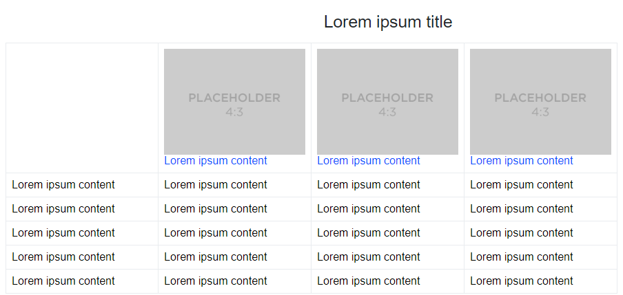
Comparison Table 1 Three Columns
Comparison table with 3 columns and images in table header.
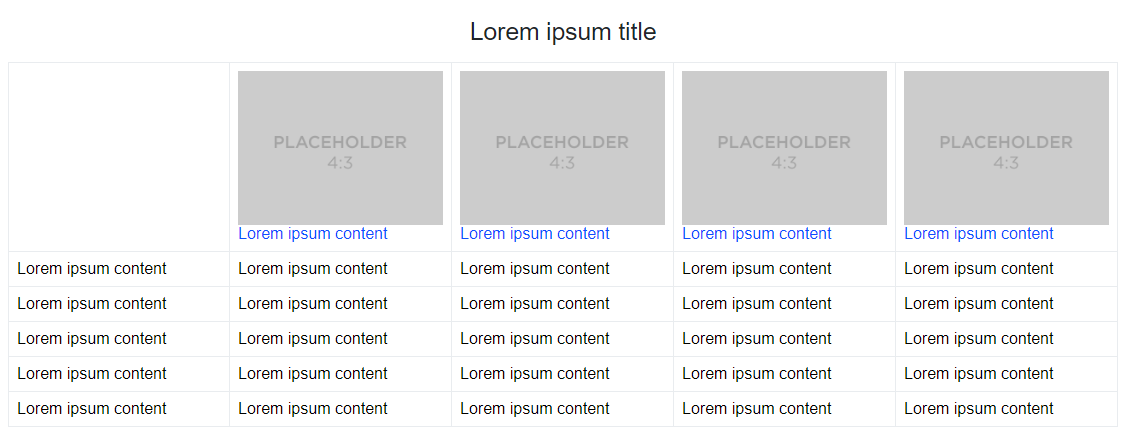
Comparison Table 1 Four Columns
Comparison table with 4 columns and images in table header.
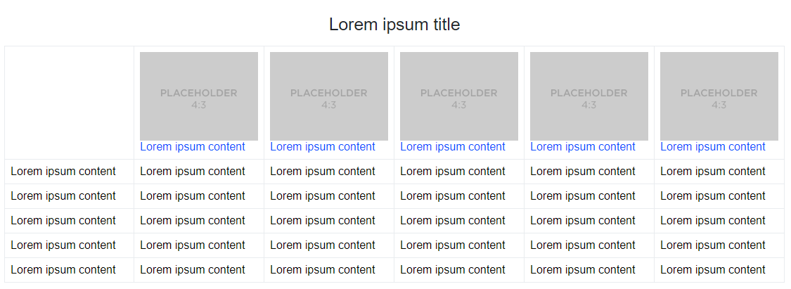
Comparison Table 1 Five Columns
Comparison table with 5 columns and images in table header.
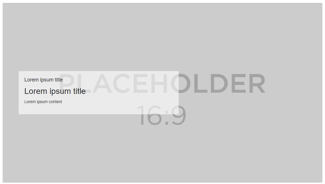
Background Image with Text
Component that shows image as a background with text on it.

Comparison Table
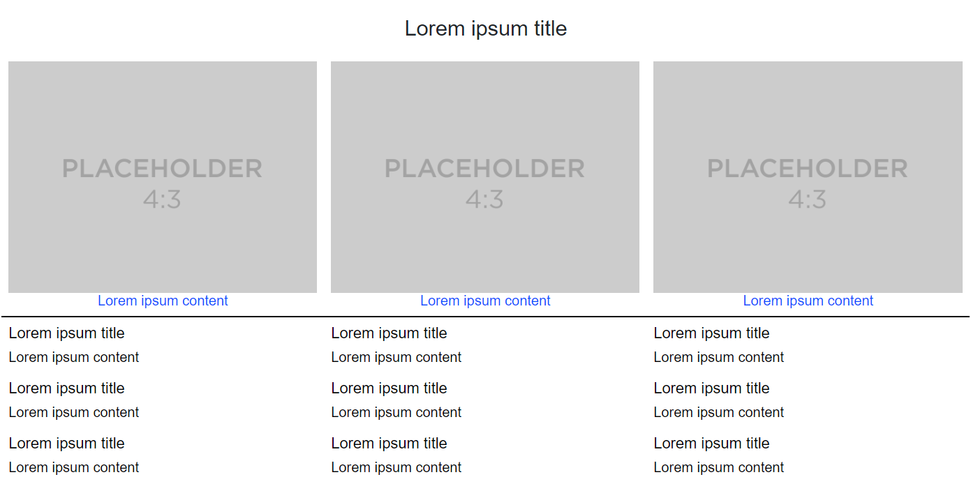
Component with comparison table.
Comparison Table 2
Another component with comparison table.
Hotspots
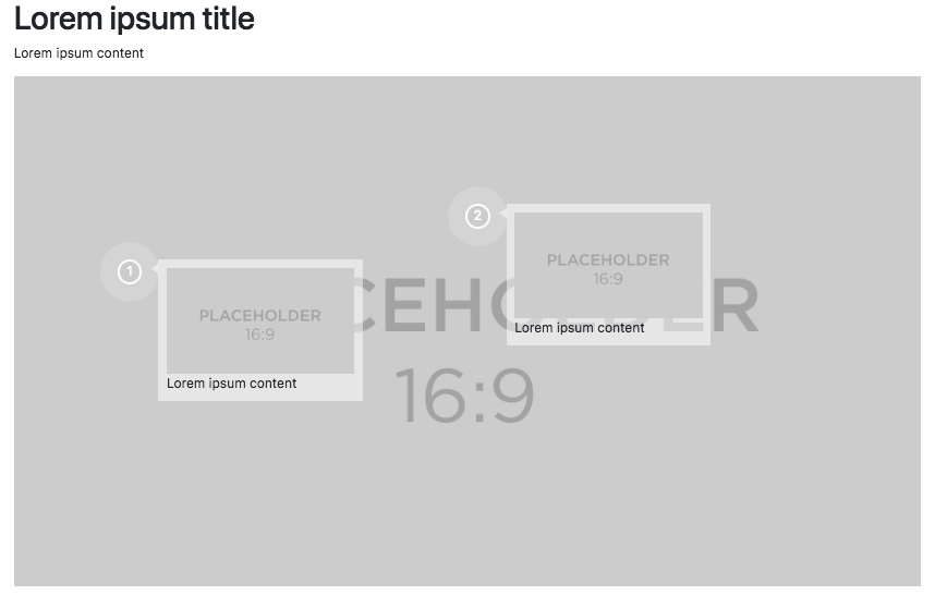
Component that displays image with interactive hotspots in desktop view and carousel with the contents of hotspot pop-ups in mobile view. Available in two variants (image carousel, text carousel).
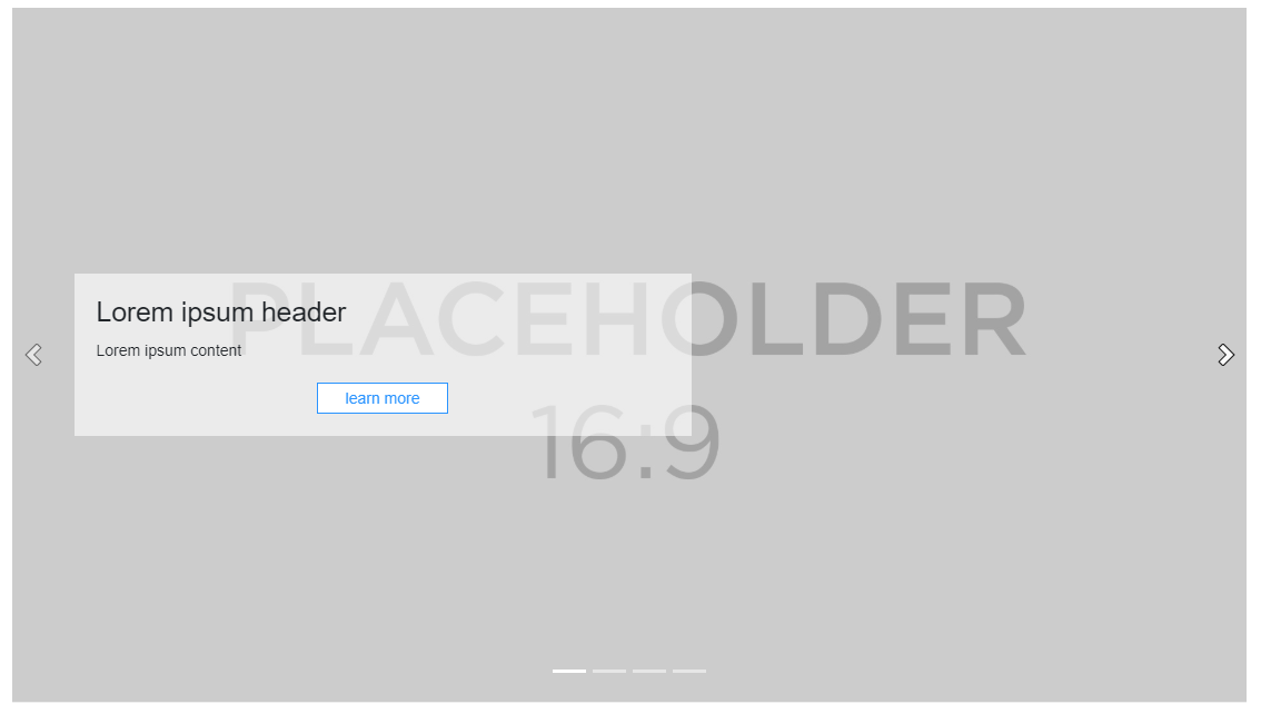
Image Carousel Optional Text (CTA)
Image Carousel with optional text and CTA in multiple variants.
Navigation Carousel
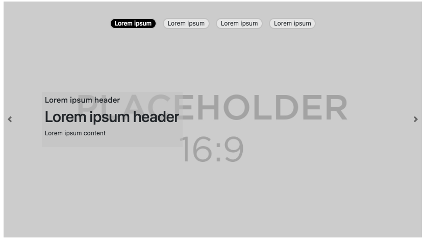
Image Carousel with editable navigation buttons in 5 variants.